
Selected Mobile App : Snapchat
Brief :
Work in a team to identify problems and/or opportunities with an existing mobile application and utilise your knowledge to design a solution
Duration:
2 Weeks
Team Members
Boyang Chew, Jack Chu and myself
My Role
Researcher, UX designer
UX Methodologies Used
Heuristic Evaluation, Competitive Analysis, Contextual Inquiry, User Interviews, Affinity Mapping, Persona Creation, Feature Prioritization, Hand Sketching, Wireframing, Prototyping, Usability Testing
Tools Used
Pencil, Paper, Sketch, Principle, InVision
Project Planning
- Listing out our objectives with a project plan helped us have a focus on what was necessary and not lose sight which we referred to during the project.
Snapchat Analysis
- Performed Heuristics Evaluation to understand how the current application flows and to identify any possible problems.
- Competitive Analysis between similar applications for an insight on each application's strengths and weaknesses.
- Additional Research on the Business and Revenue Model of Snapchat. We found out that most of their revenue comes from the sponsored content.
User Research
- We prepared an interview questions guide for the team to refer to while performing interviews of past and present users of Snapchat.
- Using the key comments and many posts its, we made an affinity map out of it to find out the common comments from users. The three categories with the most comments;
- "Stories" feature - core reason of using Snapchat
- Unfiltered/Informal Vibe - Interesting features like disappearing messages, filters and lenses
- Usage time - The average time an user spends on the app is about 3-5 mins per session
- With the three categories, we found our focus areas. To address all three, we wanted to improve on the experience of viewing "Stories" from friends while updating the informal and fun direct messaging platform, at the same time to think of ways to increase the average time spent while in the application.
- From the findings, we also created two personas. An active user and a semi-active user


Outcome
Persona that we focused on together with our focus areas


Version 0
- Worked on a pen and paper prototype as a version 0 and got users for our 1st round of usability testing with a list of tasks to perform.
- It was a good decision as we could quickly get feedback on the usability as compared to performing testing on the digitized version
- With the feedback, we went on to digitize the prototype using Sketch and Principle.
Version 1
- Our design lead, Boyang, defined the style guide. Following that, we split the key frames between ourselves to work on.
- Once each of us was done, we combined the efforts and came up with version 1 of our prototype.
- With version 1, we performed another round of usability testing with the same list of tasks as version 0
- With the second round of testing, we iterated and came up with version 2.
- This was important as getting feedback from the user's perspective allows us to validate or see if we missed out any key items.
Main features
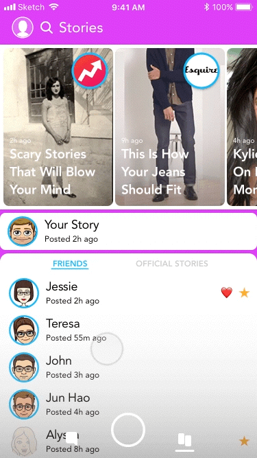
1. Viewing of Stories
- Separating direct chats and Stories into different pages, with stories being placed together with the discover page which holds sponsored content
- Advantages of placing Stories on a separate page - With users not entering the discover page, this change will bring users to a page where both content can be accessed.
- Stories will also be sorted chronologically and can be starred to listed on top
- During the user research phase, we did notice some users absolutely thought the discover page is a waste of time. Therefore we wanted to make it so that the sponsored content is not taking up too much screen space, and can be minimized upon scrolling down to look though Stories
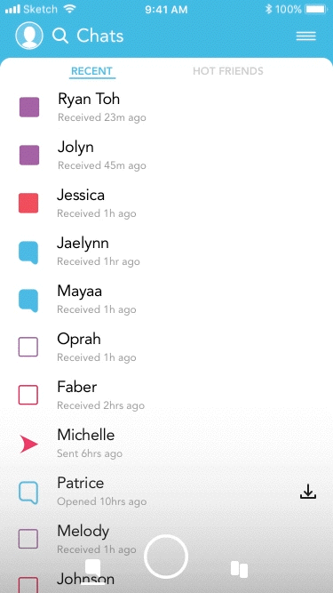
2. Personal Messaging
- Advantages of direct chats being on a page of it's own and sorted chronologically - Users will be able to search for chats with friends with ease and a style more in line with other messaging platforms
- The current sorting organization was puzzling to us and users as well, to address this we introduced two ways of sorting friends. By chronological order and by "Hot Friends" (Friends that the user has Streaks which basically meant having consecutive daily Snaps sent between each other)
3. Discovering new Content
- Seems like there was a friend location based viewing system in place, but there was no affordances to indicate this function's location. It was a swipe down or the tap of the Search area and it would also depend on whether you were on the iOS or Android OS. At the same time thinking back on our user research, users mentioned that this was a little creepy and kind of an invasion of privacy.
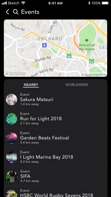
- We decided to shift the focus to the discovery of events happening around the user, it would be a collection of user stories that are situated in an area.
- Users could sort between events that are currently live or events that are nearby.
Key Takeaways
- Analyzing business and revenue models to align with user needs.
- Asking the important questions in order to find out the user's pain points.
- Paper prototyping can be useful for gathering quick feedback
- Further familiarizing with prototyping on Sketch
- Effective usability testing requires the prototype to be visually and content accurate
- Communication and having a common goal between the team is essential
Additional Links
Free feel to provide feedback if you took the time to view my project~
Additional Gallery


Additional Reads

The Verge's Article on Snapchat redesigned redesign rolling out to users

Gizmodo's Article on Snapchat new redesign to stop people from complaining

Change.org Petition to remove the new Snapchat Update